The 11 Best Restaurant Logos in the Industry
What We’ll Cover in This Piece:
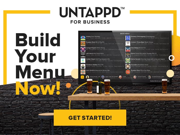
Create
Your Menu In Minutes!
Here are just a few of the restaurant logos we’ve noticed around the industry that follow these considerations and work really well.
Big Star
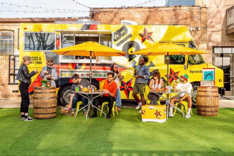
A funky, hip taco spot in the Wicker Park neighborhood of Chicago, Big Star serves honky tonk tacos along with margaritas. Their logo has a distinctive star shape with bright reds, blacks, and golds to invoke a sunny afternoon spent on their patio eating, drinking, and having a great time. If you’re from Chicago and see that emblem, you immediately know it’s Big Star.
Yolk
The simple bright block lettering with a sun over it immediately evokes the morning, which is probably when you’re enjoying a nice yolk or two, right?
Yolklore
Typography comes into play here with Yolklore’s logo. It’s simple, but a big statement. The yellow filled-in O’s look like yolks and the definition underneath (“n. Legendary breakfast”) is a clever component to the fun name.
Leafy Fresh
Here is a great example of how color connects to food. For a restaurant focusing on fresh, healthy vegetables, the deep and bright greens help connect the customer directly to this business’ ethos.
Wells Coffee
This graphic could be a little confusing, but it actually works because of the tagline underneath. The image makes us think of this place as a passionate coffee shop focused on sustainability and getting you a best-sourced, most-delicious cup of coffee.
Bottle + Kitchen
Another fun play on imagery, this logo includes two knives in white that carve out a black space in the middle in the shape of a bottle. Hence bottle + kitchen. It’s a brilliant example of how illustration and iconography can play a big part in your logo.
The Green
A golf simulator, bar, and restaurant, The Green’s logo is simple, but effective. Obviously, it’s different shades of green to match up to the name, but typography and scalability seem to be a huge consideration here too. That iconic “G” is something The Green can use across its entire brand, from posters to hats.
FourPeaks Brewing Company
This brand knows exactly who they are: a brewery representing their location in Tempe, AZ. The four peaks in the background perfectly encapsulate the brewery, and the colors and textures seem to represent Arizona.
Snooze AM Eatery
A revered brunch spot in Houston, TX, Snooze’s 1950s-style typography immediately illustrates a diner-style vibe and gives folks the impression that this will be a fun, nostalgic place to grab breakfast. The bright orange font also gives off morning vibes, perfect for a brunch place. One you’ll get out of bed for instead of hitting the snooze button.
Party Fowl
A Nashville hot chicken spot with locations across Tennessee and Florida, this restaurant simply used typography and a bit of play on words to make sure their logo was sustainable across their entire footprint. It’s the bright red, rustic lettering that simultaneously showcases farm, funk, and a little bit of heat. Hence: hot, hipster chicken.
Pilot Project Brewing
A unique brewery incubator for up-and-coming brewery projects, Pilot Project is just a super simple yet bold logo.
7 days Free - Untappd For Business
Design your beer and food menus and publish them anywhere! Print, QR code, or digital signage - the possibilities are endless with Untappd for Business!
Schedule a demo or start a free 7 day trial today!