Top Tips for Designing Your Brewery or Restaurant

August 6, 2021
There are many facets to running a restaurant. While hiring a chef and developing a cuisine is undoubtedly important, the most front-facing consumer experience is your restaurant design and concept. When conceptualizing your space, you’ll want the two—food and decor—to speak to one another, while staying on board with your brand and vision.
These, along with a handful of ideas we’ll cover when planning your space, will allow for a great jumping off point, whether you devise the space yourself or enlist the help of an interior designer.
What We’ll Cover in This Piece:
Choosing a Theme
While not all restaurants have to fall into a particular category, at minimum loosely adhering to a thematic approach can simplify the design process.
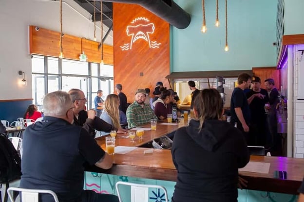
While quality food and beverage matter, the goal at Humble Sea Brewing Co., with an original location in Santa Cruz, California, and a newly opened taproom in Pacifica, California, is to bring in a robust demographic who are seeking a thematic experience. “[Our team strove to] create an environment where you wouldn’t even need beer, that beer was secondary,” says Frank Scott Krueger, Co-founder of Humble Sea.
Keeping in mind the importance of a good theme, here are several common motifs that you’ll find at breweries across the country:
Minimalist
Call minimalism the pathway to an upscale vibe. Bright whites, natural accents, and straight lines can easily add to elegance in a sleek atmosphere.
Classic
You know the old adage: If it ain’t broke, don’t fix it. You don’t always need to reinvent the wheel. Tried-and-true timeless styles age well.
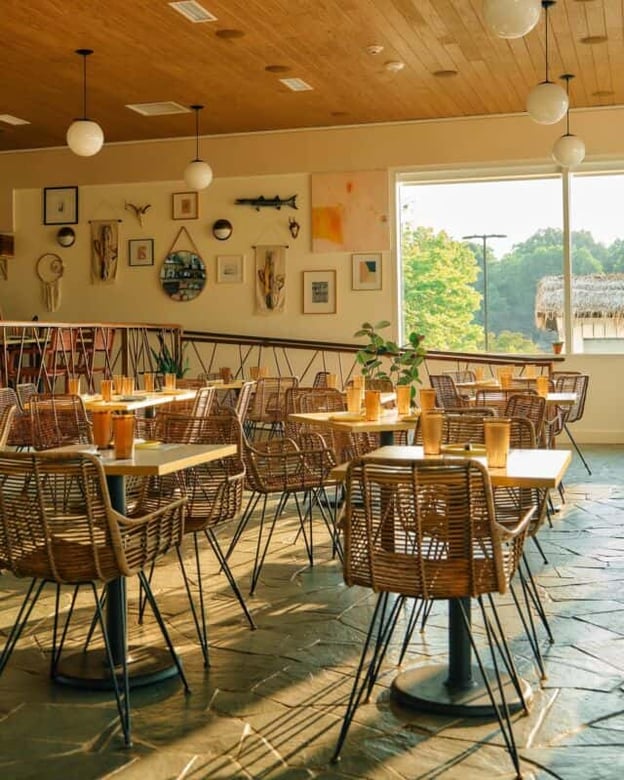
For example, Hello, Sailor, a Southern restaurant in Cornelius, North Carolina, uses a Mid-century modern theme. According to Axios Charlotte, the eatery is “one big room that’ll make you think you’re on the set of Mad Men.” Rattan bar stools with a gold and wooden bar are reminiscent of a 1950s cafeteria.
At Blue Moon Diner in Charlottesville, Virginia, a wrap-around bar looks similar to those found in Coen Brothers’ films like The Big Lebowski and The Hudsucker Proxy. Stained-glass light fixtures and patterned booths lend themselves to an authentic diner feel. Plus, the surroundings match the cafe’s elevated takes on diner food.
Boho/Eclectic/Maximalist
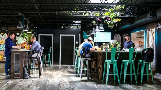
Plants, wicker, and bright colors, with the addition of vintage elements, can guide your guests in an artistic experience that is both inspiring and relaxing.
In 2018, Salud Cerveceria (then sharing space with Trade & Lore) won the title of North Carolina’s Most Beautiful Coffee Shop through Architectural Digest. Conceptualized by Salud owner Dairelyn Glunt, the design included bright colors mixed with warm wooden tables and a lounge area with plants, pillows, and ottomans.
On the back wall a luchador mural juxtaposes with framed art featuring famous rap and basketball stars by Dallas, Texas-based artist Arturo Torres. A boho-meets-hip-hop mashup sets the stage for Salud’s distinction. When done well, an eclectic decor theme can create an atmosphere unique to any other in your city or industry.
Choosing this theme for your decorative items can display your unique vision.
Moody
Modern speakeasies are the definition of moody. Low lighting, dark walls, and heavy fixtures create an almost seductive environment perfect for night lounging in an intimate setting, regardless of the size of your space.
Considering the Elements
Once you’ve determined the overall theme of your restaurant or bar, various independent elements can be leveraged to tie together the full story of your brand and identity. Even though these aspects can often be subtle, it’s that extra attention to detail that goes a long way.
Architecture
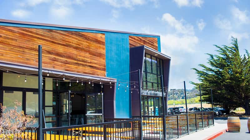
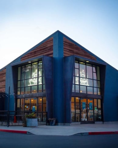
When opening their second location in Pacifica, California, Humble Sea’s team was drawn to the angular, alpine-esque architecture of the new taproom. They utilized giant windows and a unique design to create minimal external upfitting.
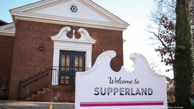
On the other end of the spectrum, Supperland, a restaurant and cocktail bar in Charlotte, South Carolina, took up residence in a historic church. By taking advantage of the exposed brick as an internal design element, Supperland stayed true to the building’s original design. And as a centerpiece, the establishment installed glass garage doors to bring the outdoors in, staying open in the warm months and creating a visual barrier during the cold season.
When choosing a space or building one yourself, the shape can play a key role in brand identity and memorability, setting you apart from other restaurants and attracting customers eager to be in a unique space.
Tilework
Tilework is an often understated element that can bring your space together. For Davidson, North Carolina-based coffee shop and bakery Summit Coffee, CEO Brian Helfrich, under the design direction of his wife Tyler, implemented tilework along their bars as a unifying element of each of their franchise locations. At each enterprise the tilework speaks to the specific neighborhood and vibe of the shop, giving the separate sites their own unique feel while at the same time keeping an overall brand throughline.
“The tilework is different in each cafe,” Helfrich says. “This is a great distinguishing element and we work hard to customize every location to fit the neighborhood they are in.”
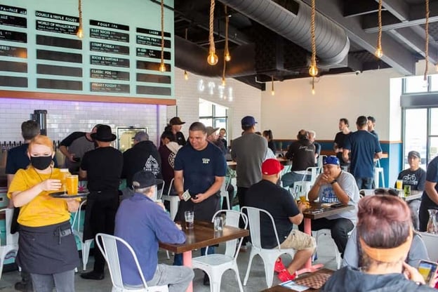
Similarly, Humble Sea utilizes white tiles along their walls to create texture and brightness to offset the dark navy tones and highlight the seafoam green.
Lighting
Helfrich also says that the choice in fixtures is an important and intentional part of the process. The type of lighting will affect the mood and ambiance while fixtures themselves can easily elevate your space. Finding something that fits within your theme—like exposed Edison bulbs for an industrial vibe or rattan-style pendant lighting for a boho aesthetic—is an easy way to keep your design consistent through the small details.
Conversely, consider letting in natural light. The inclusion of a skylight at Salud Cerveceria or large floor-to-ceiling windows at Humble Sea Pacifica brings in outside ambience while incorporating unique architectural design.
Flooring
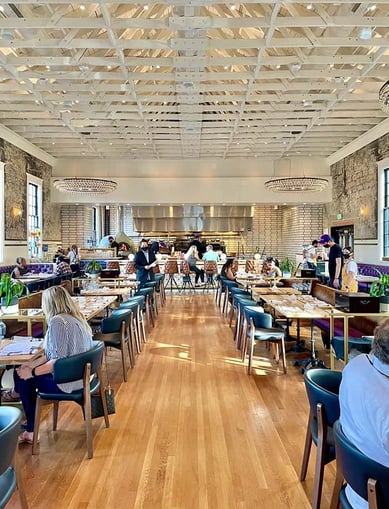
Summit Coffee NoDa franchisees, Melissa and John Varvaro, took heed of the advice a family friend and Gap store designer gave them.
“We were worried our concrete floors were too scuffed and were looking to fix them,” Melissa says. Instead her friend told her to let them be. “Customers are more comfortable with flooring that looks lived-in. When it’s too clean, they feel uncomfortable to move freely in the space,” says Melissa.
Not all floors need to be scuffed, but you should take into account foot traffic and the overall goal of the space. Because again it all comes back to your theme.
The Summit Coffee NoDa location kept its scuffed, concrete floors. Similarly, Supperland stayed true to it’s 69-year-old building’s original design by keeping hardwood floors throughout.
Artwork
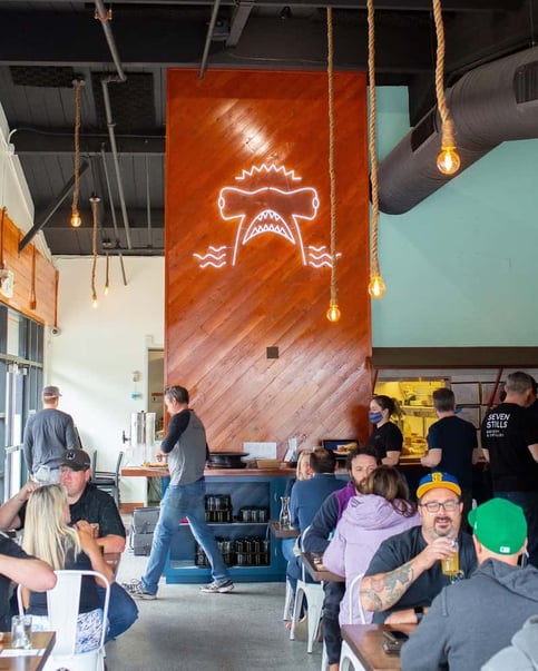
When designing Humble Sea’s Pacifica location, Scott Krueger looked at each wall as an artistic opportunity to incorporate specific brand elements. The Pacifica location utilizes blank space to feature a neon hammerhead shark on one wall and a neon sail boat on another.
At Summit’s NoDa location, local art gives the space a rotating gallery feel while engaging the community. Choosing art that fits the space, both size-wise and stylistically, can solidify the decor.
If murals or art aren’t an option, an easy solution is to choose a patterned wallpaper, which adds evergreen art regardless of your restaurant’s theme.
Natural Elements
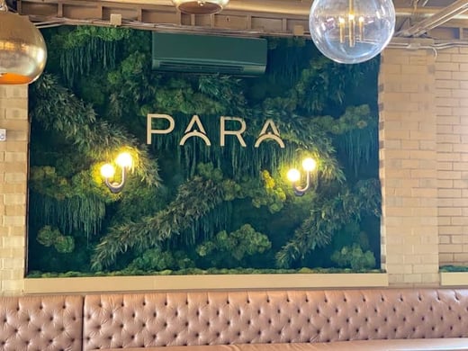
New concept PARA Charlotte has incorporated The Savage Way, a company offering what they call Clean Graffiti and Moss Art. The North Carolina-based restaurant added moss to cover the bar shelving wall to create “a warm, nature-y feel inside,” says owner and designer Torrie Savage. Bringing the outdoor elements inside to mingle with the chosen colors of green, gold, black, and white adds a unique element guests can capture and share while enjoying unique decor.
“They wanted to have an Instagramable moment,” says Savage. “It’s like nothing Charlotte has seen.”
The Savage Way continued the implementation of natural elements through a lush, green, fern-covered wall, measuring 12 feet by 9 feet that intermingled with PARA’s logo.
“Everybody craves nature. Studies show that bringing natural elements in…evokes relaxation into our psyche. People want more nature to create the calming, attractive feel we get when in nature. The preserved plants means they'll remain indefinitely with no maintenance, allowing for a long-lasting, lucious vibe,” says Savage.
Likewise, Humble Sea uses driftwood planters filled with succulent gardens on brick walls to blend natural and industrial elements. “People ask us all the time if these gardens are for sale—it’s always a good sign if people try to buy your stuff,” says Scott Krueger.
Seating
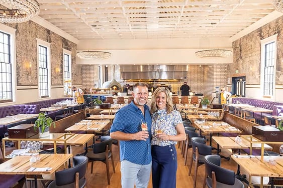
The goal of any hospitality business is to put butts in seats. And those types of seats can actually establish your overall atmosphere.
Here are a few common types of seating:
- Community Style
Large tables that are shared by all patrons even if you’re not in the same party. For example, New York’s Momofuku features a tight-knit seating arrangement with community-style tables, allowing patrons to be elbow to elbow during their dining experience; it is part of the charm of this iconic establishment. - High Top
For breweries, pizzerias, and other casual eateries, high-top seating can allow a comfortable, bar-like atmosphere. Having high-top seating in your bar and lounge area is perfect for happy hour or before-dinner drinks. - Booths
This type of seating has many purposes. Booths can create a diner-style or even elevated feel for your space. Simultaneously, they give large parties a sense of privacy. Supperland’s tufted round booths with plum purple leather and leather-lined pews play off the restaurant’s historic past as a church. - Bistro
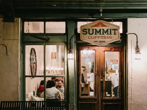
For Summit Coffee’s flagship (aka “Basecamp”) location in Davidson, North Carolina, rustic wooden shelves lined with lucious ivy sit above a row of round tables surrounded by French bistro chairs. The seating arrangements along a color-blocked wall of white and teal just across from the tiled coffee bar creates a look that is unique to this location while staying within a concept that is uniquely Summit.
Five Key Things to Remember From the Experts
We know this seems like a lot to process, so if you only take away a few tidbits from all this advice, adhere to these five considerations.
Flow
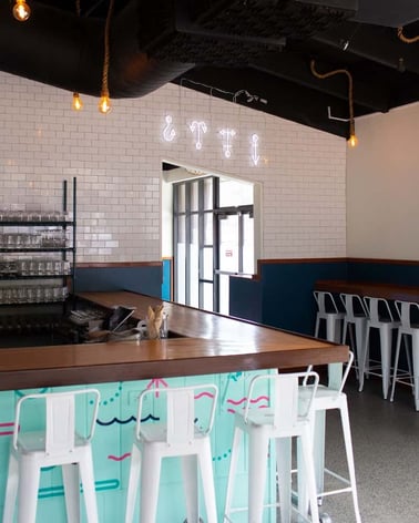
At the Humble Sea Pacifica taproom foot traffic and flow was top of mind when determining placement of tables. “The volume we were doing can’t be efficiently done from a single bar,” says Scott Krueger.
With this in mind, the team implemented two accommodations: QR codes at tables that allowed patrons to order from their seats (thus minimizing congestion) and a second entrance for online orders and retail, cutting down on the amount of people waiting in line at a given time.
Seeing the success in this shift, the team implemented this approach at their flagship Santa Cruz brewery and will follow suit at any new locations.
Consistent Brand Identity
You’ll find Summit Coffee’s signature teal color throughout many of the company’s design elements, from adorning the windowpanes of the 19th century building that is home to their Basecamp location to a minimalist outline of a mountain on their soft white coffee bags. The bright blue hue exists in both the restaurant and product design to create brand recognition.
For Humble Sea, the same stains and finishes are implemented at both the Santa Cruz and Pacifica locations. Similarly, the same typography can be found throughout all their cans and other merchandise no matter where it’s sold.
Neighborhood
While you may have a brand identity, choosing a decor that fits your location is important. Humble Sea will be opening a third location, built in 1874, in a historic tavern in the Santa Cruz Mountains.
“We don’t want to splash this space with a bunch of seafoam,” says Scott Krueger. “It’s a cream-colored building and we want to keep it that way. We are reacting to the space and building rather than jamming our brand into it. It will still feel like a tavern, though it will be uniquely Humble Sea.”
Likewise, the neighborhood dictates design choices for the Summit Coffee locations. The new South Park store “will be remarkable yet approachable,” says Helfrich, while the NoDa Arts District location engages a rotating art collection from homegrown artists and vendors. This approach makes each location authentic to its neighborhood.
Timeless/Current
Design trends can change quickly. Choosing a timeless theme, perhaps even with interchangeable elements, will keep your space current and prevent it from looking dated within a few years of opening. Trends can be a challenge to predict, so being sure not to lean too far in one direction will help ensure your space translates for years to come.
Inclusivity
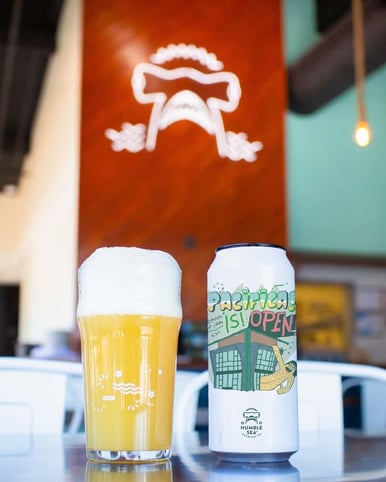
“When we started Humble Sea, craft beer was overly masculine,” says Scott Krueger. “The big brands at the time were making things geared towards the hypermasculine, which in turn ostracized a good portion of current and potential craft beer drinkers and customers.”
The warm cedar tones implemented in the taproom, along with neon signage and bold art choices, were meant to create a welcoming space. “People come in for the vibe,” says Scott Krueger. “We aren’t trying to be beer-nerds only. We are making beer and an environment for everyone.”
Additionally, making sure your restaurant is ADA compliant gives guests of all abilities an equal opportunity to enjoy your space. Humble Sea has chosen high contrast menu boards for visually impaired guests and has provided ample space between tables for maneuvering.
LaChrista McArthur of The Barista Coalition says that taking into account the type of people you will attract with your design is important to consider.
“People get so caught up in the vibe of an establishment that they forget that vibe might be exclusive. Yes, you have a vision for what you want your establishment to look like, but if it doesn’t support a male with dreads who’s into RunDMC and has an interest in your product, does it foster an environment where this person could come in and be himself behind the bar or as a customer? Would he be too loud? Too ‘hood’? Is there a specific type of black person you want to apply and attract?” says McArthur.
One Final Note - When to Hire a Designer
If you don’t know the first thing about design, it’s time to bring in the pros. Even for people like Scott Krueger, who has a background in graphic design, branding, and iconography, interior design felt like a whole different beast. Though he built the “goofy, quirky brand” design elements from typography to color scheme, Scott Krueger says his design expertise was 2D.
“I’m not an interior designer,” he says. “That’s a completely different skill set.”
Knowing their collective strengths and limitations, Humble Sea brought on interior design firm Stripe to implement brand guidelines, utilizing existing architectural elements and implementing the colors, fixtures, and identity of the brand to create continuity in a way that made sense for both the brand and the space.
Creating the look and feel of your space, whether it's a kooky taproom by the ocean or a restaurant and cocktail bar inside a historic church, sets your brand apart, invites customers in, and ultimately determines what makes your establishment unique. It’s worth taking the time to invest in your exterior and interior design whether you do it on your own or hire a group of professionals to lead the way.
Tap Into Over 9 Million Users in the Untappd Community
Untappd for Business can help increase your revenue while providing powerful insight and analytics about what your guests are drinking locally.
Get started by scheduling a demo with one of our experts or start a free 7 day trial - no credit card required!
