Craft Beer Labeling: What Makes A Good Craft Beer Label (2024)?
UPDATED: 2/2/24
You can brew the best milkshake IPA on the planet. But, if your beer label doesn’t catch the eye of the consumer and meet all the requirements mandated by the Alcohol and Tobacco Tax and Trade Bureau (TTB), your beer won’t stand out on the shelf. Or even make it to the shelf.

“A beer label is the number one way consumers will interact with your brand,” says Matt Tanaka, Founder of Stout Collective, a design-driven creative studio rooted in beer that designed over 500 beer labels last year alone. “In a world with 9,000+ craft breweries in the United States alone, you have a fraction of a second to catch a consumer’s eye on the beer shelf. It's a really competitive space. The way to compete is with label design.”
To say it simply: Your beer label will determine if someone buys your beer.
“You really can’t overstate how important your brand is,” says Tim Corcoran, co-founder of Massachusetts-based Coastal Mass Brewing (nee Channel Marker Brewing), whose distinctive labels have set the tone for the brewery and consistently impress a loyal following. “Your can label designs are the first thing you should think of when it comes to a brewery’s branding, in addition to your logo.”
When considering something as important as designing the perfect beer label, there are several things that need your consideration, starting with legal compliance. From the visual design to why you can't use the abbreviation IPA to pressure sensitive versus shrink sleeves, we’ll show you how to create the perfect beer label.
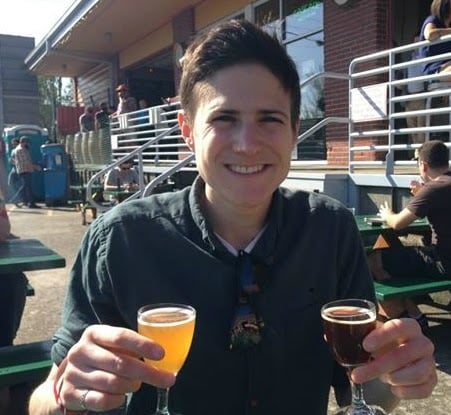
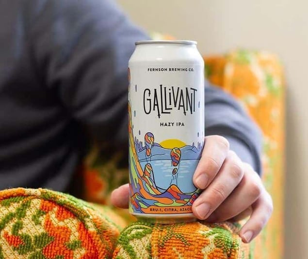
Above Artwork by Matthew Houle
What We’ll Cover in This Piece:
- How Do You Define Your Brand?
- Creating a Visual Identity for Your Brand
- The Elements of Good Visual Identity
- Find the Right Designer for your Beer Label
- The Fine Print, aka TTB and COLA Requirements on a Beer Label
- Submitting Your Beer Label for TTB Approval
- Printing the Perfect Beer Label
- Beer Labels We Like, and Why
- The Final Word on Beer Labels: Dress to Impress
Source: Blue Label Packaging
The first step to creating the perfect beer label is to make sure you understand your brand. Ask yourself, “What is my product? What am I selling? Is it an ale? A lager? An IPA? Does the beer have some unique ingredient or hop? Is it American, German, English, or something else?
“We think label design is the extension of someone’s brand identity, not just pretty pictures on a can, but a vibe you’re trying to communicate to customers,” says Tanaka. “The consumer makes decisions about your brand and what they want to drink in the moment. They don’t do it based on who you are -- they do it based on who they are.”
With that in mind, you’ll want to narrow down exactly who you’re targeting. Who is your ideal customer? Even the funniest Game of Thrones meme won’t hit home with your parents if they’ve never even seen the show.
That said, you can’t satisfy everyone, so a label needs to focus on your core group. Is your beer for craft connoisseurs or local folks looking for just a drink or two after work? Millennials who post all over Instagram or mountain biking, hiking, and adventuring thirty-year-olds?
Lastly, consider how consumers are buying your beer. Are they picking up a six-pack as they shop for their family at the supermarket? Do they seek out a specific craft beer store like a BevMo! or Binny’s or even a small, independent craft beer shop? Are they purchasing online? Determining where your target consumer buys your beer the most can help establish your brand personality.
Just like the beer itself, your brand’s personality will develop over time. But answer these questions now and you’ll be ready to move onto the next step.
Once you’ve established your brand personality, you need to translate it into a visual identity. In layman’s terms, you need to be able to take your flagship Simcoe and Citra IPA and visually communicate its ethos to the world. Whatever you come up with needs to make sense in your brand family, whether it's your flagship beer or a one-off chocolate s’mores porter with marshmallow and graham cracker.
Tanaka starts the visual identity process by asking his clients to find things in the world they like, whether that’s a concert poster, album artwork, or apparel design. Spend a week collecting images that are attractive to you. It can even just be things you come across on the Internet or from scrolling on your phone. The key is, don’t think about it too much, just choose pictures based on a gut reaction.
Tanaka then takes these images and tries to determine a pattern.
“Maybe you want to go down the route inspired by 70s psychedelic art or inspired by anime manga,” says Tanaka. “Whatever it is, we create buckets and just keep going down those roads.”
Finding a unifying theme is necessary because it will affect all of your label decisions going forward. Instead of trying to come up with a new idea for each label, design a specific system for your brewery and stick to it.
“We generally recommend starting with the content because different types of content can back into the art style, but it's harder to go the other direction,” says Tanaka. For example, say you have a beer called Darts. You want to design a label with a dart board and the name spelled out in dart feathers. While that design schema will work for a beer called Darts, it doesn’t work for one called Tricycle. However, if you know that your system starts with bright colors and 90s pop culture then you can take a beer like Darts or Tricycle and back it into your overall theme.
When it comes to craft beer label design, here are the top five things to keep in mind: color, shape and size, typography, style and imagery, and copy.
Color
A pop of color is often the first element that attracts attention. Color can be powerful enough to evoke memory, emotion, and even seasons -- have you seen a pumpkin beer that doesn’t incorporate some hue of orange or red? We often associate warm reds, oranges, and yellows with the hefeweizens and marzens popular in the fall while bright pastel greens, light blues, and lilac purples go with Maibocks and Blonde ales of spring. Color is a shortcut for you to prep the consumer for the beer inside.
“I start with the artwork and the artists to come up with something with a great color scheme to pop off the label and catch your eye,” says Corcoran.
Color is a teaser, a way of setting consumer expectations. And if you’re using bottles, be sure to think about the colors of the bottles, too. A brown, green, or clear bottle, as well as the color of the liquid inside, will affect the color of your label.
Label Shape and Size
Do you want a traditional shape and size or something custom? Going the custom route might make your label standout, but it could also increase the printing costs.
For example, the popular Brooklyn-based brewery Other Half specifically uses labels designed for 12oz cans on 16oz cans. The smaller wrap gives their beers an iconic look that stays consistent across all of their beers.
Generally, label shapes fall into three categories: partial wrap, full wrap, or custom shape.
Partial wraps come with two separate labels, one for the front and another for the back. This is a common label type with bottles specifically, typically sized at 3.5” by 4”. The most important consideration here is to make sure that your printer can accommodate front and back labels on the same roll.
Full wraps mean your label goes around the whole bottle. With these types of labels, you’ll have more room to design and add important details. But remember -- with your bottle or can sitting on a crowded shelf,most likely the consumer will only see the first third of your label. You can have the most intricate design in the world that wraps around your whole can, but unless the front causes someone to pick it up, they’ll never see all that beauty on the back. Corcoran says that he had to learn this lesson the hard way. He actually recommends printing out your proof and wrapping it around your can because the 2D image on a computer screen can look very different in real-life 3D.
Similarly, Andrew Boyd, President of Blue Label Packaging, an all-digital packaging printer based in Lancaster, Ohio, always tells his clients to print out mockups first.
“I’m a big fan of testing things out before you commit,” he says. “There is no reason to gamble with something this huge. Always get a mock up that’s color correct. Check the colors out in real life because things look very different on the screen than in the physical world.”
Finally, custom shapes can be a really fun, easy way to make your beer label stand out. Just make sure that it will actually fit on your bottle and can. One easy step here is to take a regular piece of paper and cut out the mock shape you’re going for. Wrap it around your bottle or can to get an idea of the space you have to work with while also checking for general fit. You can measure this final shape to share with your printer.
Whatever you decide, make a decision based on your overall brand identity. If you’re an edgy, contemporary brewery focusing solely on spontaneous fermentation, maybe you’ll want to go the route of a custom shape. But if you’re a traditional lagerhaus, a standard full wrap will probably serve just fine. Figure out your budget, stick to your brand, and go from there.
For reference, here’s a handy chart from Blue Label Packaging that lays out the most common label sizes.
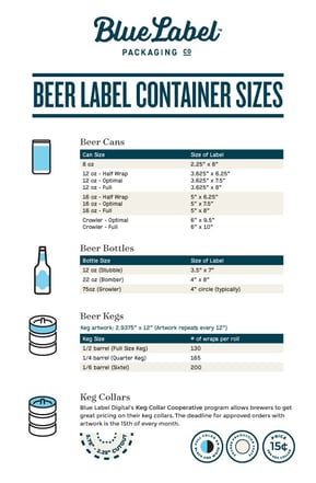
Source: Blue Label Packaging
Typography
Much like color communicates feelings and emotions, typography can indicate your brand style and personality. A classic Serif font (one that contains little feet at the end of letters) says your brewery is more traditional, while a sans-serif typeface comes across as more modern. Similarly, different creative fonts evoke other things. Insider tip: remember that consumers and the TTB need to be able to read the words on your label!
Style and Imagery
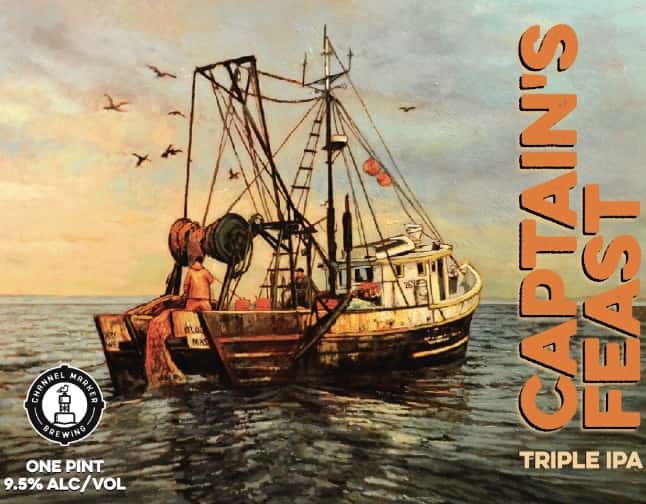
Nowadays, craft beer labels have become a form of art. Labels on beer cans cover the gamut from cartoon-style illustrations and comic panels to handcrafted masterpieces and work commissioned from local artists. At Channel Marker, Corcoran works with an artist in a studio next to the brewery to design custom oil paintings that are then turned into digital impressions and placed on their can labels. It’s a laborious process that often takes six to eight weeks, but the incredible art reflected on their unique can labels is paramount to the brand’s identity. Channel Marker also employs one of their front-of-house servers who is also a graphic designer.
“The number one thing for me is the artwork,” says Corcoran, whose labels almost always play into a nautical theme and feature vibrant colors. “We enjoy telling a story of some kind with our beer labels. When people come to buy cans, they always ask about the labels. It’s reassuring that people are noticing we’re putting in the time to make something cool and special and it makes me want to keep putting in the time and effort even if it costs more time and money.”
Words
Last but not least, the first words that people read on the label will be important. Let your consumer know what your beer is! If it’s an imperial stout, write that. If it’s an IPA (see notes below), indicate that. The most helpful step here is to build a huge word bank that you can whittle down to the most important names that your designer can use to create the art.
Seem like a lot? Well, the good news is that the beer industry isn’t held to the same standards as many others.
“There are many different ways to make a ‘good label,’” says Tanaka. “But one of things we find fun about label design in the beer world is that a lot of rules for classic good design are completely broken. If you look at some successful beer labels and try to apply them to someone making soup or granola it would never pass. But our world is fun and exciting to explore.”
Source: Top Hat Design
If you’ve made it this far into the article, you’ll understand when we say that the best advice we can give here is to go with the pros. Whether that’s a freelancer, design agency, or professional graphic designer, it’s imperative that whoever you hire has experience designing labels specifically for craft beer, or is willing to figure them out.
Typically, designs for a single label cost anywhere from $100 to $1,000. If you forgo a bigger design agency, consider finding a professional artist. Corcoran not only works with an artist who owns the studio next door to his brewery, but also one of his staff members.
“We hit the jackpot with our two artists,” he says. “Find an amazing artist and don’t try to do it all yourself.”
Tanaka agrees. “I’m biased, but I would recommend sacrificing most other things before label design at this point,” he says.
If budget is a consideration, think about hiring a local artist from your community whose work you appreciate. Spend money on commissioning artwork instead of hiring a big design firm. The design may be a little bit simpler and you’ll still have to navigate the TBB legalese yourself, but you’ll still be able to create a unique brand identity for the right price.
Whatever you do, make sure you establish clear communication with your artist.
“If you have a specific vision, communicate that as clearly as possible,” says Corcoran. “If you do a poor job communicating your vision, you can’t be disappointed when you get something back from the artist that doesn’t match your vision. Be specific with what you want.”
Source: Jackrabbit Design
While you explore the whimsical and wacky world of brand identity and label art with your designer, you’ll need to keep at least one foot on the ground because the government requires certain things of beer labels. If you’re putting cans of “malt beverage” (i.e. beer) into distribution, you need to follow the rules for label design set by the TTB, aka the Alcohol Tax and Tobacco Trade Bureau. Before you hit “print,” make sure the TTB signs off on your design by issuing a COLA, also known as a Certificate of Label Approval (COLA).
“There are definitely all these quirky things [with labels] so make sure you have a legal team to give you good advice from day one and go by the book,” says Corcoran.
Boyd agrees, “Even in the most beautiful label design, you need to save room for the necessary stuff,” he says. “It isn’t sexy, but it’s necessary.”
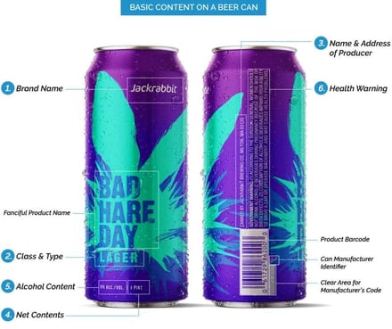
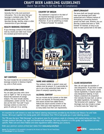
According to the Brewers Association, you’ll need to follow the following ten guidelines in order for the TTB to approve your label.
Brand Name
The official name of your beer. Generally, it's the most prominent information on your label. Your brand name cannot describe age, identity, or origin of your beverage and it must be on the front of your label. If your container contains greater than 8oz of liquid, it also needs to be in a font that’s at least 2mm tall.
Class and Type Designation
This refers to how you designate the type of beverage inside your bottle or can. The aforementioned “malt beverage” is a catchall term the TTB uses for a product made at a brewery with malted barley and hops. For example, beer, ale, and lager are all examples of class designations. Even if you just write India Pale Ale somewhere on the label, you’ll meet this requirement because you used the word “ale”.
Note that the TTB does NOT consider the term “IPA” acceptable. And if you only use that acronym, it’s an easy way to get your label rejected. You need to have the word “ale” typed out at least somewhere on your label. For example, many breweries will use IPA on the front of their label, but then include “India Pale Ale” in the minimum font size (again 2mm for beverages 8oz and above) somewhere else such as on the back. You can find all the specifics listed in Chapter 4 of the TTB’s Beverage Alcohol Manual.
Name and Address
You must include the producer, bottler, or packer’s name and address on either the front, back, or side of your container.
Net Contents
This is the measurement in fluid ounces or pints of your beer. It needs to appear in American English on the front of your bottle or can in legible, 2mm tall font. Here, the TTB requires you to include the word “FLUID” or shorthand “FL”. So “12 FL.OZ” or “12 Fluid Ounces” is acceptable, but “12 OZ” or “12 ounces” is not.
Alcohol Content
Finally, something that’s optional! Including the alcohol content or ABV number isn’t required, though it’s generally good practice. If you plan to include this, do NOT write ABV -- you need to write it out. Express the percentage of alcohol by volume as 7% ALC/VOL or 7% Alcohol/Volume, but not 7% ABV. This is a common mistake that’s easy to avoid!
Mandatory Health Warning Labels
According to the TTB, any alcoholic beverage that is for sale or distribution in the U.S., contains more than 0.5% alcohol by volume, and meant for human consumption must contain the following government warning statement: GOVERNMENT WARNING: (1) According to the Surgeon General, women should not drink alcoholic beverages during pregnancy because of the risk of birth defects. (2) Consumption of alcoholic beverages impairs your ability to drive a car or operate machinery and may cause health problems.
Country of Origin
U.S. Custom and Border Protection regulations require that if a beverage is imported, the label must include the origin country somewhere on the label. You can simply write “Product of Canada” or “Brewed in insert country”.
If your beer was made in the U.S. and is just for sale in the U.S., you do not need to add a country of origin.
Draft or Draught
Generally, using these two terms indicates that your beverage hasn’t been pasteurized and that you’ve used a different way to eliminate bacteria growth.
Even if your beer has been pasteurized you can still use the term “draft brewed” as long as you indicate somewhere on the label that the beer has been pasteurized.
Lite / Light / Low carb
Functional beverages have gained popularity over the past few years so if you want to indicate on your label that your low-cal IPA has “less than 96 calories” or is “below 5g in carbs,” you’ll need to back that up with what’s called a Statement of Average Analysis.
Really, the Statement of Average Analysis is like a nutritional information label that includes the serving size, calories, carbohydrates (g), protein (g), and fat (g).
Insider tip - you can only use the term “low carb” if your beer contains no more than 7 grams of carbs per 12oz serving.
Final Note On The Fine print
All of this mandatory information above needs to be legible, which means it appears in 2mm for any beverages 8floz or above. Beverages less than that require only 1mm size font. This information is not meant to be an exhaustive list or serve as legal advice. The Brewers Association has more information here.
Also, don’t forget to leave room for a UPC code! You’ll need one if your beer is sitting on a shelf in a store.
Source: Avery
You’ve discovered who you are as a brand, hired an artist for the label, and gotten your COLA approval. Now, how do you physically bring your label to life?
After a good designer, Tanaka says that working with a good printer is paramount.
“It drives us crazy when we design a label, get the aesthetic right and then [see people] cheap out on the printing method or designer,” he says. “It ruins the whole thing. Printing matters. The label should feel like what it's supposed to feel like when someone holds the can. Each has a place and it's important to know what’s right for the situation.”
On a basic level, you have three decisions to make when it comes to printing: the type of label you’re going to use, the material, and how you’re going to apply it to your bottle or can.
Types of labels
- Pressure-sensitive labels (PSL or PS labels)
Think of these labels like a sticker. You use pressure to adhere the label to your bottle or can. You don’t need water, solvent, or heat to apply these labels, meaning they’re easier to apply and you have a lot more freedom to change material right up until the point of canning. - Shrink sleeve labels
Think of these labels like a skin or mask. These labels create a full 360 wrap around your cans. Heat is used to apply these labels so that they conform to the exact shape of your container.
With every square inch available, shrink sleeves give you plenty of space to visually represent your brand and fit in all the necessary information for the TTB. Also, these labels are a bit more durable, since they’re heat-bonded to the can and waterproof. Boyd says shrink sleeves can be great for mid-sized beer runs or flagship beers.
According to Boyd, the decision on which type of label to use comes down to figuring out what works best for your business. Shrink sleeves and pressure sensitive labels are similar in cost, but with shrink sleeves you normally need to buy an entire palette of already sleeved empty cans, meaning the lead times can be a little longer. And you need to buy more cans outright, whereas with pressure sensitive labels you have a lot more flexibility to change things at the last minute.
According to a 2018 AWA Market Report, shrink sleeves account for 18 percent of the total label market.
Label materials
- Paper labels
Paper labels give cans an embossed texture. These can have the look and feel of something slightly fancier.
The cons of this material is that it’s susceptible to water damage, and the bottling and canning process includes a lot of moisture.
“We’ve seen lots of beautiful labels that look like crap on the store shelf because the rough bottling process caused water to leak down and get under the liner,” says Boyd. “You can’t protect [these labels]. Because of this, somewhere around 90 percent of what we do is on film.” - Film
The more popular, more robust option. Most typically, film labels are made from BOPP (biaxially oriented polypropylene), which is essentially a laminated label that’s protected against the elements.
Application methods
- By hand
Hand-labeling is a time-consuming process but can be cheaper than other methods, especially when doing small runs. - Machine application
Lots of breweries don’t invest in label applicators from the start, but they can pay off in man hours down the road. For example, Corcoran at Channel Marker used to manually apply labels, but invested in a Dispensa-Matic Label Dispenser last summer to help the brewery keep up with can volume.
While you can generally order samples from any printing company, here’s where leveraging the expertise of a digital or traditional printer really comes in handy.
“A label provider understands what the beer industry needs specifically, knows the questions to ask, and the problems you can run into,” says Katie Harrington, Marketing Manager at Blue Label Packaging. “Are you applying by hand or using an applicator? Will the label come in contact with water? Is it going in a cooler or not? Is it sitting on a shelf? Is the decoration going to work? Can substituting something help achieve a look? There are so many possibilities that go into production to make your concept come to life.”
“All of us would agree that the people that are expressing themselves to the fullest extent possible are the most successful brands,” says Boyd. “They had a vision of what the beer’s character and personality should look like. Those are the memorable packages.”
Turn of the Tides, Costal Mass Brewing (nee Channel Marker Brewing)
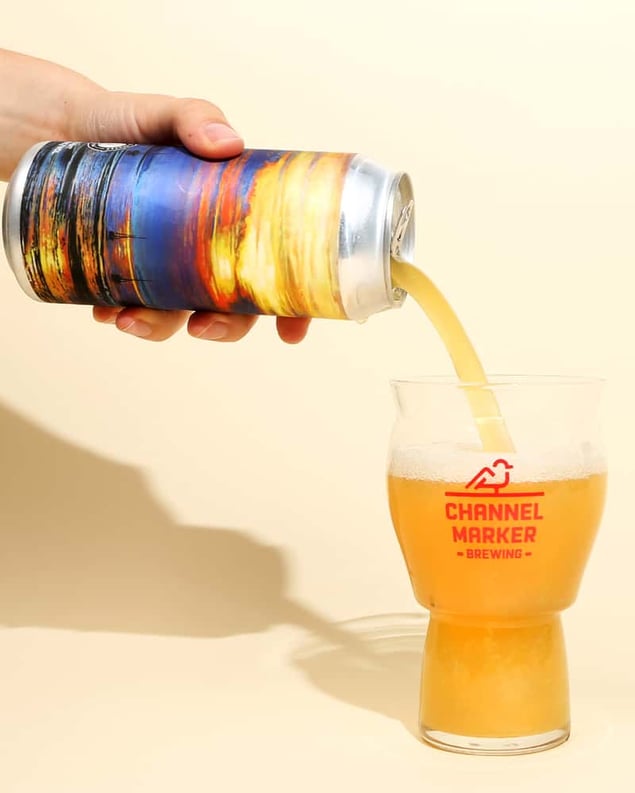
Art by Andrew Houle
We love a brewery that riffs on a theme. And from their brewery name to the names of their beers (Navigate the Channel, Propeller, Flagship, etc.), Channel Marker Brewing plays with nautical tropes to reinforce a sense of place: smack dab on the coast of Massachusetts, just outside of Salem.
With Turn of the Tides, that theme gets a boost from the art of Andrew Houle. Looking almost out of place on a beer can, Houle’s gallery-worthy art works with light and clouds to place the scene firmly off Massachusetts’ coast. Look at the can and you can almost feel the salt in your hair.
Survival Mode, Channel Marker Brewing
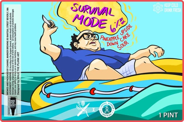
Art by Max Plank
While working in the front-of-house for four months, Max would often doodle on his iPad behind the bar. Corcoran eventually discovered him and started commissioning his artistic talents for labels.
Most recently, Plank’s label for a collab with Branch and Blade Brewing Co. called Survival Mode leveraged Max’s specialty with cartoon caricatures to represent a scene from the iconic television show It’s Always Sunny in Philadelphia.
“Max drew an amazing cartoon Danny Devito in a life raft,” says Corcoran. “This label had one of the biggest responses we’ve ever had on social media to a new label in a while. People went crazy. We had so many comments dropping quotes. This is a brand new label, but it quickly became a front-runner for me.”
All Labels, Other Half
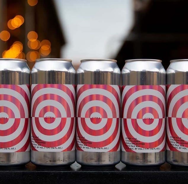
Art by Stout Collective / Printed by Blue Label Packaging
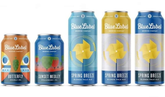
Other Half produces a very large number of labels, but somehow manages to keep each one unique and yet consistent to its brand.
“When a new label comes out, we sit down with Sam Richardson, the brewmaster, and look at the name and recipe to develop how the feel would be best accomplished -- whether it’s with an all over pattern, cartoons, or a geometric pattern,” says Tanaka. “Regardless, all their concepts are defined, so the beer falls into one of them and even though there’s a huge variety there is still a level of consistency.”
Boyd continues, saying, “What’s crazy about Other Half is that there’s 97 pages of beer on their website right now and 12 beers per page -- that’s like, 1,000 beers. But the designs are so varied that no two are alike. Somehow they all portray the brand. Every week, we see another set of innovative labels coming from them that take these constraints and blow it out of the water.”
Hunter, 18th Street Brewery
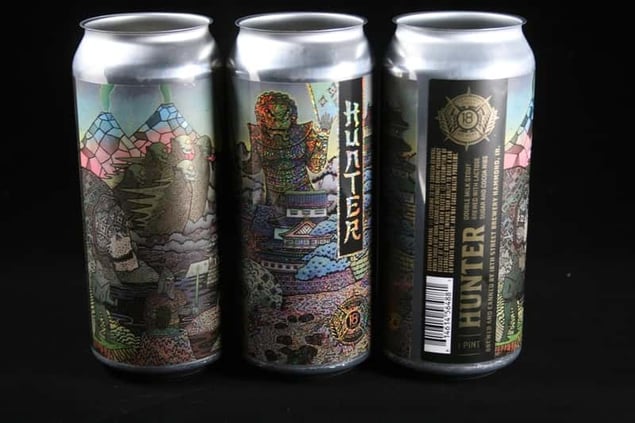
Art by William Test / Printed by Blue Label Packaging
This particular label won a second place 2020 HP Inkspiration Americas Award. The can uses a metalized glitter material to really make it pop and has a crazy illustration with an immense amount of detail that’s enhanced by the glitter. It’s a label that perfectly speaks to 18th Street’s creative beverages!
Hollywood Acid, Brouwerij West x Hop Culture Magazine
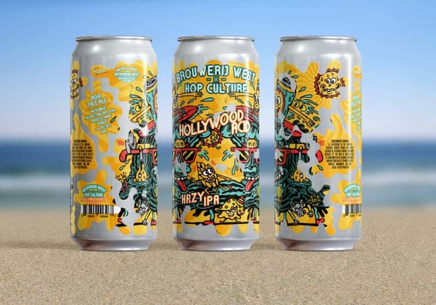
Art by Killer Acid / Printed by Blue Label Packaging
If you’ve ever seen a Brouwerij West label, you know any of their products would’ve made a worthy inclusion to this list. The brewery uses a special application process to turn their cans into works of art.
We’re huge fans of the Popfuji and Bounce cans, but Hollywood Acid — with art drawn by our Northern Californian friend Killer Acid — holds a special place in our hearts. By day, Killer Acid creates art for his own online store as well as several major brands: Zumiez, Urban Outfitters, and Pittsburgh’s Vinyl Remains, to name a few. But he occasionally works on fun beer projects, and that includes this label for Brouwerij West’s Hollywood Acid, which was a collab with Hop Culture. The talented team at Brouwerij West then took Killer Acid’s art and made it even more special with the aforementioned label application process, which saw the design chopped, screwed, and applied as several individual stickers. The result was one of the most interesting cans we’ve seen this year, not to mention one of the best Double IPAs.
“Brouwerij West is very innovative,” says Boyd. “They have this cool, eclectic nature where all these pieces combine in a collage that is a very unique approach and branding for them.”
See Why Breweries Like You Are Making The Change
Ollie is the affordable, easy-to-use software to manage your brewery and operations. See why breweries like yours are making the switch.
